Ever since the first Octopath Traveler, I have truly believed in the wonders of Square Enix’s HD-2D aesthetic. The brilliant melding of Square’s expertise with pixel art and 3D models has enamored me and continues to do so. That’s why, after getting a chance to try the upcoming Dragon Quest III HD-2D Remake at PAX West, a game I love in a series I love even more, I’m so bummed that this remake is also the first game in this style that feels like a bit of a step back for the HD-2D treatment.
 In all the HD-2D games I’ve played, the visuals seem to fit together—from the backgrounds to the sprites used on the world maps and in combat. It all comes off as a cohesive aesthetic, and I found this cohesiveness lacking in Dragon Quest III. I want to also draw the distinction between “looking good” and “being cohesive.” My issues with the demo largely have nothing to do with the game’s visual appearance – it looks good! My issue is that bits and pieces of the visuals look like they have been pulled from different games, and the resulting aesthetic looks to me as such. There are two areas that stuck out particularly so with said clashing visuals, the first of which being the environments.
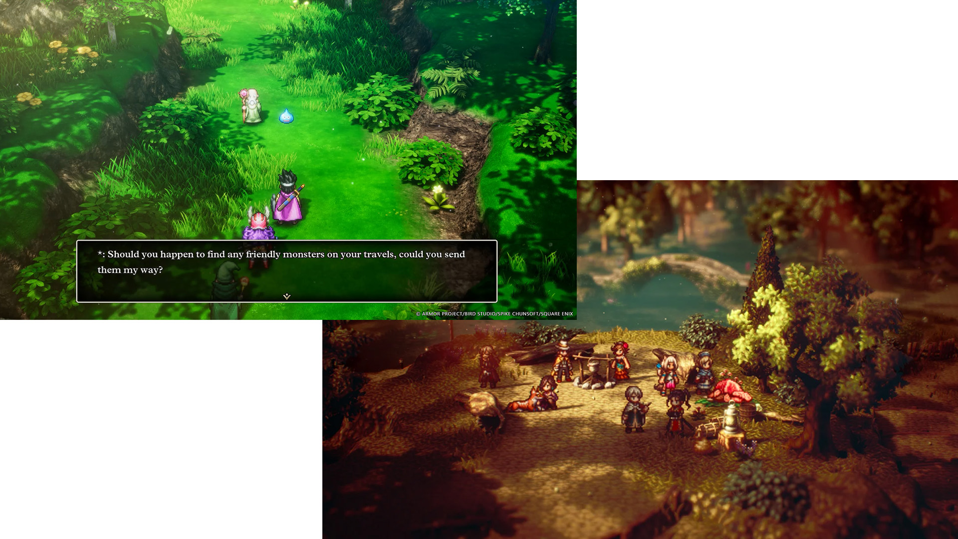
In other titles like Triangle Strategy, Live A Live, and Octopath, the environments—while being 3D—still had textures that gave off the appearance of pixel art. This approach helps tie the 2D sprites you control into the world, grounding them in the game’s reality. But in an odd twist, this has been omitted from Dragon Quest III. Instead, the environments—from the towns to the dungeons and even the world map—while still 3D, lack those pixel-inspired textures and opt for more “realistic,” almost generic-looking ones. This results in the character sprites standing out and feeling a bit out of place, reminding me somewhat of Eiyuden Chronicle from earlier this year.

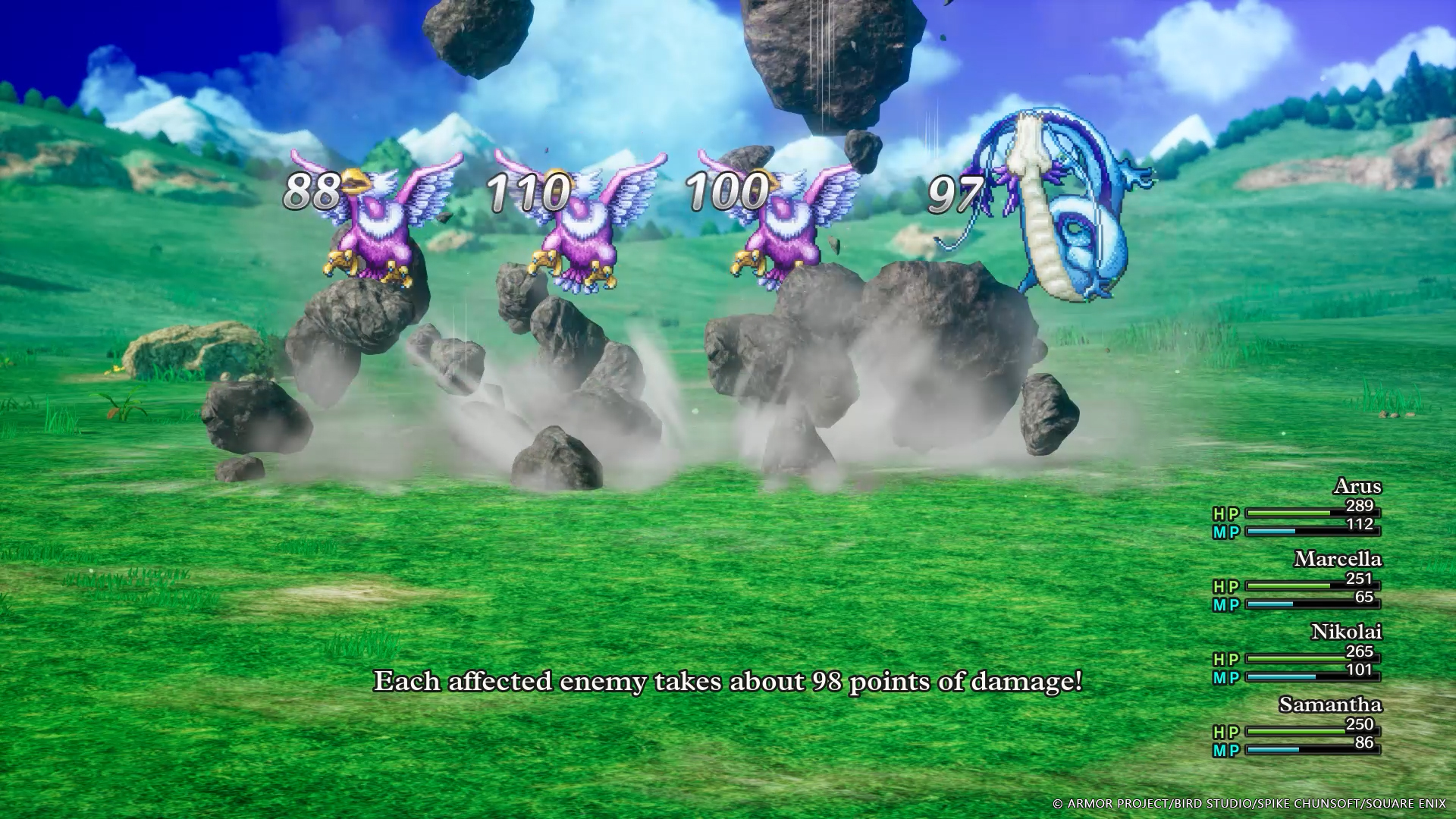
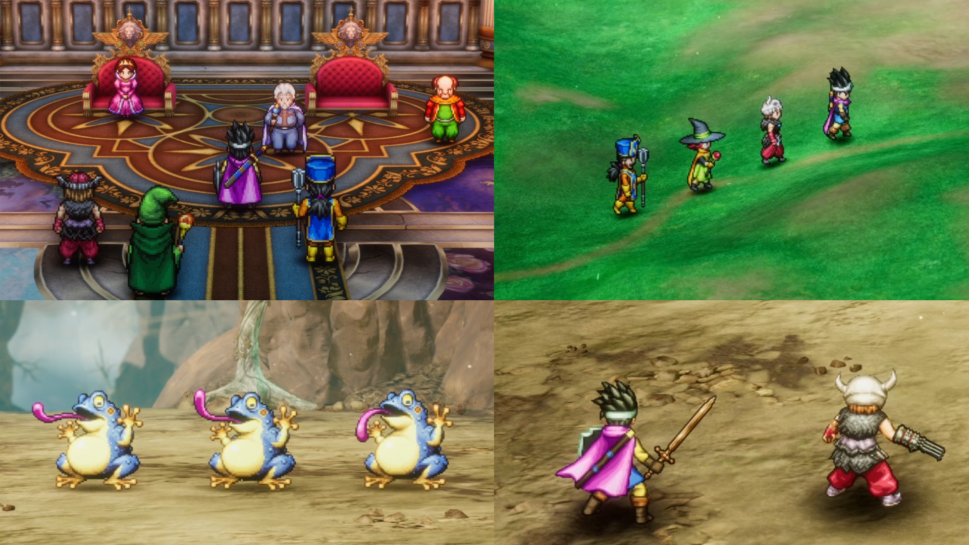
The other area that stood out to me was in combat, particularly the sprites used for your party members. In combat, instead of using a similar version of the sprites used outside of combat (which I think looks really good), the sprites appear to be of a considerably higher pixel density. I found this especially noticeable in the Hero’s cape and the mage’s cloak in my party, both of which had a far wider range of gradients and smoother animation. They stood out against the monsters’ designs, which appear to be more in line with your party’s sprites outside of combat. And again, all of this is set against a background that doesn’t try to appear in a pixel style. It was all just very strange to me. Taken individually, every instance of pixel art in the game is wonderful and expertly crafted. But together, I just find it jumps from one style to the next, with the end result feeling disjointed and less cohesive than the other HD-2D games.
 Now, to be clear, I have no issue with the gameplay of this latest classic remake—it’s still the same brilliant game that fans have fallen in love with and a great time to play. The care that the team has taken with expanding things like the Monster Arena—which is now a far richer and deeper experience—and the brand-new Monster Wrangler vocation, which delivers a unique system to work into your lineup, are welcome surprises. And that’s to say nothing of the other additions that Square has been keeping a tight lip on, which we’ll have to discover for ourselves!
The Dragon Quest III HD-2D Remake remains one of my most anticipated games of the year, and the HD-2D aesthetic continues to be one of my favorites in modern games. I’ll be sinking my teeth into the game when it releases on November 14, and I wouldn’t be surprised if it doesn’t let me go until the new year.


