How important is a game’s visual identity?
Whether or not people like to admit it, graphics and visuals play a huge part in games. There have been arguments for years about whether or not a game’s graphics matter in the grand scheme of things. Yes, gameplay will always reign supreme, but a game’s visuals are right up there. Not only because people don’t want to be controlling a cluster of polygons anymore, but more importantly a game’s graphical style creates a game’s identity.

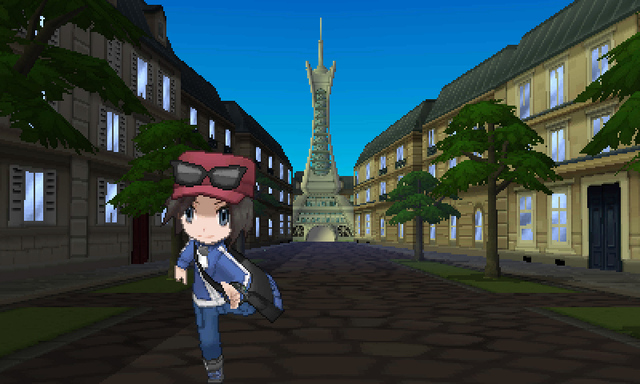
October 12th will mark the release of Pokemon X & Y. The one problem that has some fans up in arms is the game’s decision to move from sprite-based graphics to polygons. The change in style is probably due to the game trying to evolve and change, but with the drastic graphical differences, I can’t help but wonder if the game will suffer a loss of identity when the sprite-based series people have known and loved since 1998 becomes a more standard looking polygon-based game.
An infamous example of a visual change is Insomniac Games third-person shooter Fuse. In its beginning, Fuse was called Overstrike, and sported a bright look accompanied by quirky characters. After months of not addressing Overstrike, Insomniac reintroduced the game, now called Fuse, with what many today would consider “standard” graphics.


Gone were the brightly colored environments and quirky characters; in their place was a duller looking game with characters that, while quirky at times, no longer fully meshed with the world they were in. So much of what made Overstrike stand out were its visuals, and without them, Fuse became your average, third-person, cover-based shooter.
Not all changes in a game’s visual design is bad however. Though it got a lot flack when it was revealed, The Legend of Zelda: Wind Waker went on to be one of the most celebrated Zelda games to date. The choice to make the game with cel-shaded graphics not only made the game bright, but allowed the character designs of established Zelda characters a new and interesting look. The game also aged much better than games in the series that would follow it, because of the timeless style of cel-shading. The visuals for Wind Waker helped identify the game’s tone; it felt lighter the previous entries, but when the story got dark the visuals added to that in a powerful and shocking way.

Maybe I’m just being a curmudgeon who is afraid of seeing a series I love change a part of its identity so much. Maybe the concerns with Pokemon’s graphical alterations are about as warranted as Wind Waker’s were. I’m not so sure though. Whether we notice it while playing or not, a game’s visual identity really changes the experience we have when we play it. Would we look back on Wind Waker as fondly if it had looked like Twilight Princess?
Nintendo made a bold move with Wind Waker by making its visuals stand out against the crowd and go against the grain of what was expected. Fuse went in the opposite direction. It went from being something striking and different to being something that felt safe and familiar; by doing so, it lost it’s visual identity.
I just hope Pokemon is making the visual change for the right reasons.


